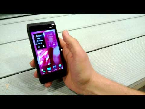
Since the end of Slush and Jolla’s big reveal of its MeeGo-based Sailfish OS, there has been genuine interest not just in the company and its mobile operating system, but in the new user interface that Jolla has developed along with Sailfish.
Simply called Jolla UI, it was developed from the ground up to fully optimise the operating system. It is heavy on gestures, because just like the Nokia N9 before it, Sailfish OS does not have any capacitative buttons – so all interactions with the OS is via swipe gestures.
Further, Jolla has also introduced some new features on its Jolla UI never before seen in any mobile operating system. Head on after the break to find out.
As an operating system borne out of the now-defunct MeeGo-Harmattan operating system developed by Nokia – and, incidentally, most of the team are now in Jolla – it is difficult not to notice the parallels between Nokia’s Swipe UI and Jolla UI. Indeed, users of the only MeeGo-Harmattan device, the Nokia N9, will find plenty of familiar gestures that are used in Jolla UI. However, seeing as Swipe UI is an intellectual property of Nokia – who refused to license it to Jolla – the Jolla UI has been developed from the ground up.
Regardless, Jolla UI does have some tricks up its sleeve. For starters, the status bar that usually sits at the top of most smartphones has been removed. Jolla’s developers feel that the status bar takes up too much space on the home screen for it to be your home screen. Should users want to see the time, check battery status or the network status – the three things that are on all status bars – users need only swipe downwards a little to “peek” on the lockscreen, where all the information is.

Speaking of which, the lockscreen is another feature Jolla UI has worked some wonders on. Here, every important information is presented to the user without them needing to unlock the phone. Also, a column on the right of the lockscreen is actually the central notification system, where a swipe to the left expands it, with more details.
Swiping up on the lockscreen unlocks the phone, and brings users to the single home screen. We’ve already touched on this part in our earlier preview, so we’ll move along to some of the apps that were demoed.
One of the first apps that was shown is the People app. Here, Jolla took inspiration from Windows Phone’s People Hub, but decluttered it. When on the People app, there are thumbnails of the user’s favourite people – the ones that are contacted the most. There is, of course, a search box for the other contacts, but everything looks clean without a long list of names – just photos of the people you care about the most. Tapping on a thumbnail expands a list containing the person’s information, and tapping the thumbnail again retracts that list.
Next up is the Phone app’s UI. At the SDK demo, Jolla developers revealed how a working phone application that pulls contact information from the phone can be written for the Sailfish OS in only thirty lines of code. This may not mean much for the consumer, but thirty lines of code makes it very efficient and thus uses less energy and also makes it perform faster. Of course, this means the app is as simple as it gets: a call log, and a numpad that can be brought up at will. Interestingly, with the numpad open, a horizontal swipe of the numpad will change the type of calls the user wishes to make (basic call, VoIP calls, etc).

In all Jolla UI-optimised applications, a glow at the top of the screen indicates that there is a drop-down menu. Jolla calls this the “pulley menu”, which differs to the drop-down menu in the way it interacts with the user. Unlike other drop-down menus, Jolla’s pulley menu has visual, audio and also haptic feedbacks for each option on the pulley menu that the user scrolls through, which means that the user can theoretically use this OS without looking at it the entire time. Also, without having to tap anything on the pulley menu, Jolla UI further enhances the one-handed usability of the OS.
Navigating in an OS with no capacitative buttons will be a shock to Android and iOS users, but having used MeeGo-Harmattan, I can honestly tell you swiping is one of the most intuitive input methods there is. Sailfish OS tries to build on the intuitiveness of MeeGo-Harmattan by negating any use of virtual “back” buttons. In MeeGo-Harmattan, there are “back” buttons when the user is in applications with multiple menu “layers”, such as Settings. Sailfish removes this “back” button, and instead relies on a horizontal swipe to the right (that is not from the edge of the screen) to go back to a previous menu. To assist users, there is a visual aid in the form of tiny white dots at the top of the screen to show users how many “layers” of a menu they’re in.
Finally, there is the personalization options of the OS that Jolla calls “Ambience”. Essentially, Ambience creates themes from a wallpaper that the user chooses, and integrates it system-wide. All the user needs to do is to select a photo from the Gallery, swipe down to open the pulley menu and select “Create Ambience”. The OS then intelligently adapts the UI’s colour scheme to match that of the photo’s, which the user will immediately see.

Honestly, some of the descriptions of Jolla’s unique UI does make it sound very confusing. However, don’t be fooled: everything in Sailfish and Jolla UI is kept as simple as possible; the design language of the OS is true to its MeeGo-Harmattan roots. CEO Marc Dillon stated that the speed of an OS isn’t about the speed of execution, but rather it’s about minimising the required actions to achieve a result.
Have a look at the UI demo videos, and you may just be pleasantly surprised.
(Image Source: esphoneblog.com)
Follow us on Instagram, Facebook, Twitter or Telegram for more updates and breaking news.


