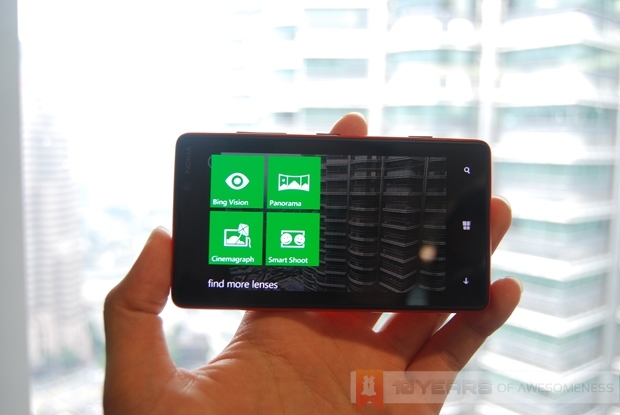
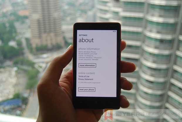
Imagine our surprise, when at a Microsoft preview of Windows Phone 8, the elusive Nokia Lumia 820 and 920 showed up. Knowing the increased interest in the new line of Windows Phone 8 devices, we set out to get our hands dirty with Nokia’s new Lumia 820 and 920, just as we did with HTC’s surprise appearance at last weekend’s PC Expo.
To recap, the Lumia 820 is the latest mid-range entry in the Lumia lineup of Windows Phone 8 devices. It has a 4.3-inch, 480 x 800 AMOLED display with Nokia’s ClearBlack technology. Nokia has also added its sunlight readability enhancements and high brightness mode into the 820’s screen. The super sensitive touch feature found in the flagship Lumia 920 is here, too.
Read on for more.
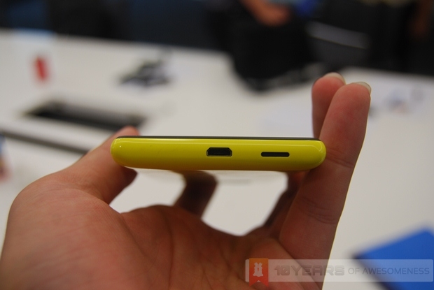
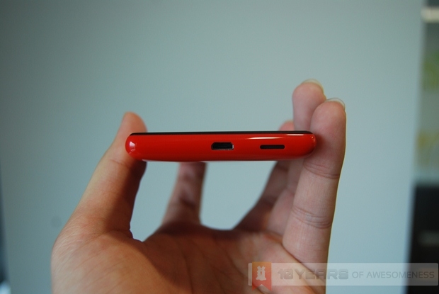
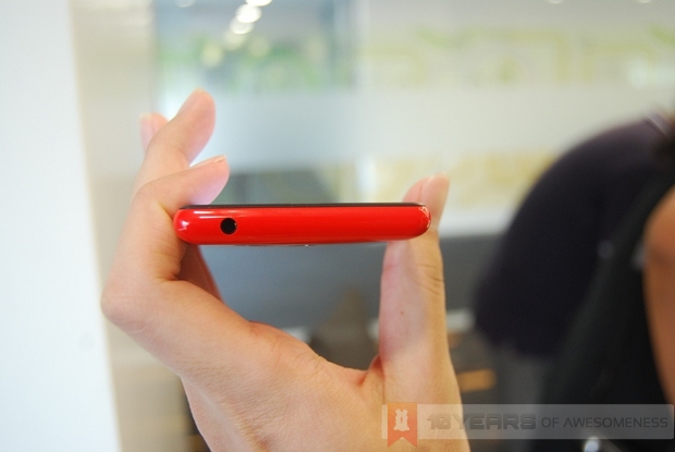
The bottom of the Lumia 820, where the micro USB port and speaker are located
Holding the phone in the hand, and it becomes clear that this is very much a mid-range device. Part of the reason why the old Lumia 800 and 900 felt amazing in the hands is due to the matte finish of the polycarbonate body, which gives a reassuring sturdy feel and grip. However, with only selected colours in the new Lumia 820 and 920 getting the matte treatment – the red and yellow variants we were shown were glossy – the jury is out there in terms of that premium feeling for the glossy finish.
Personally, the glossy finish of the Lumia 820 felt a little too plasticky for my liking – the same feeling I had when holding Samsung’s Galaxy S III and also the Note II. While I’m sure they are made from rigid and sturdy polycarbonate (which is a higher “grade” of plastic) it didn’t give me the same premium feel I would expect from a high-end smartphone, not to mention a Nokia.
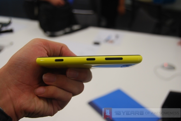
Right side of the Lumia 820: (L-R) Camera shutter, Power/Lock button, and volume rockers
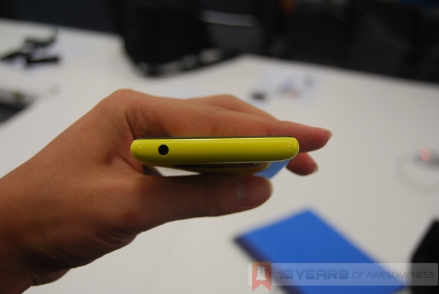
The top of the Lumia 820 is bare except for the 3.5mm audio jack
Thankfully, the glossy surface wasn’t too much of a fingerprint magnet. Despite over ten people having some time with the 820, there were no visible smudges at the back of the phone (which, incidentally, was so glossy it was a nightmare to capture pictures of).
In addition, despite being thinner than the old Lumia 800, the dimensions of the 820 felt a little…odd. This was most probably due to the 15:9 aspect ratio of the screen, which makes it a little shorter than expected. It wasn’t too much of an issue though, and once I got used to the feel of the phone, I realised that the aspect ratio really did make one-handed usage easier, as no part of the screen was never too far for my thumb.
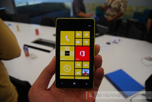
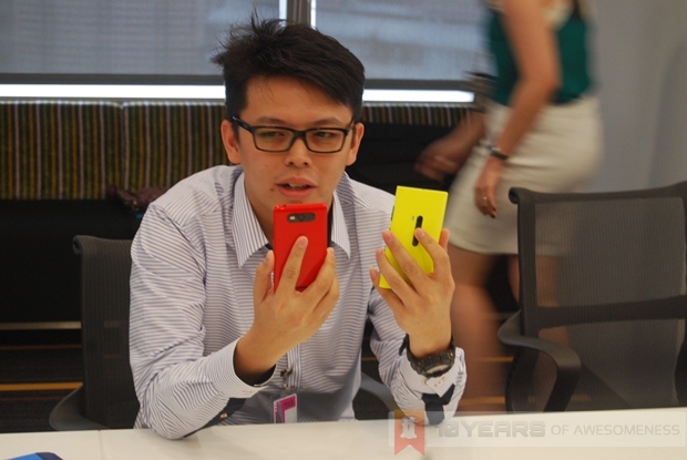
A Nokia representative holding with the glossy red Lumia 820 (left) and glossy yellow Lumia 920
One of the biggest differences between the Lumia 820 and 920 is at the back, where Nokia has redesigned the camera layout, putting it right at the top of the phone flanked by the flash and Carl Zeiss logo. The entire camera module is surrounded by a ceramic plate, which is also what the side buttons are made from, making them less scratch-prone and actually classier with its subdued sheen.
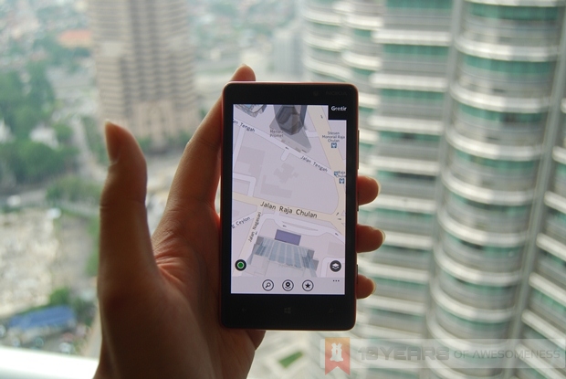
Nokia Maps with 3D landmarks
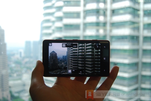
Nokia City Lens
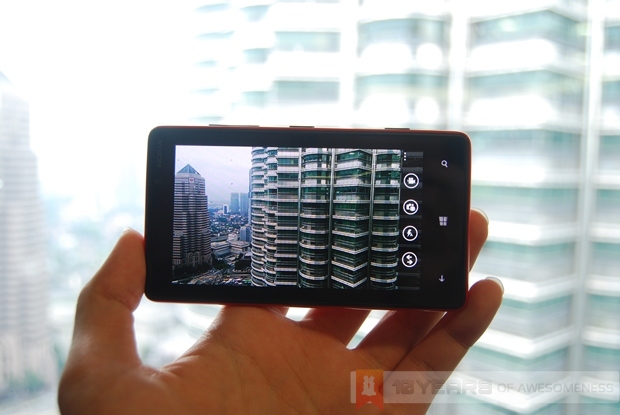
The camera UI on the Lumia 820
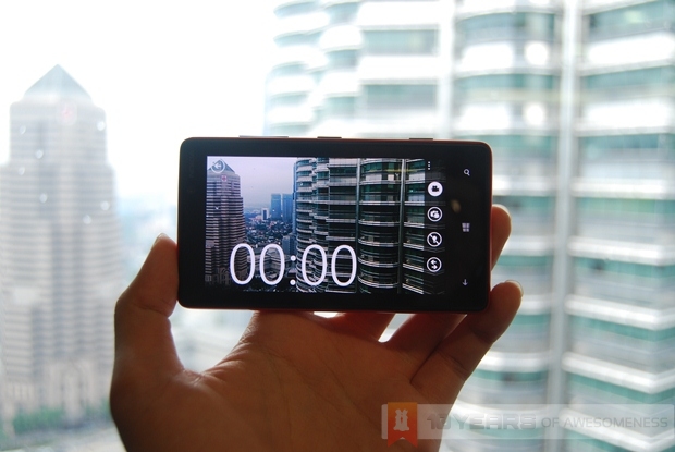
The video recorder UI on the Lumia 820
The Lens app, accessible from the Lumia 820’s camera app
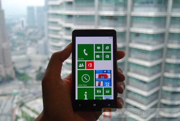
Finally, we come to the best and worst feature of the Lumia 820: the screen. I’ve always liked Nokia’s ClearBlack technology on its AMOLED screens, due to its unbelievably deep blacks that make the screen and bezel virtually undistinguishable. It’s the same here on the 820. With the “dark” theme on in Windows Phone 8, the Live Tiles really stand out with its punchy colours – yet another benefit of AMOLED screens. Another interesting observation was that at full brightness, the Lumia 820 was much brighter than the IPS LCD screen of the Lumia 920.
While we could not try out the high brightness mode and sunlight visibility enhancements (we were indoors), I did also test the super sensitive screen (which can be turned off, suggesting that this may have some impact on battery life) with my nails. And, just like the numerous videos that Nokia has churned out about it, the screen easily detected the tip of my fingernail as if it was an entire finger. A very subtle enhancement, but a cool and practical one at that.
With me gushing on the display so much, why am I saying that it is also the worst aspect of the Lumia 820? It’s simple, actually. The resolution. Frankly, smartphone 480 x 800 resolution on a 4.3-inch screen is something that would be launched two years ago. With most smartphones now going for HD (and even Full HD) screens, a resolution that low makes the Lumia 820 sound rather…primitive. Uninspiring. Possibly even an insult to the other great stuff that was worked into the 820’s display. Don’t get me wrong, because just like the Lumia 900 before it, if you don’t squint you won’t realise the low resolution, but put the 820 side by side with the 920 (with its 1280 x 768 resolution – the highest of any smartphone to date) and the parity in sharpness becomes apparent.
Nevertheless, those who don’t see an issue with the screen would find the Lumia 820 a pretty versatile device, due to the changeable back covers. Unfortunately, this was a preview for Windows Phone 8, and not the Lumias, so there were no accessories for both the Lumia 820 and 920 around. We were, however, promised that we will be having more quality time with Nokia’s latest and greatest Windows Phone 8 smartphones – complete with accessories – in the coming weeks, so stay tuned for our next preview of the new Lumias!
Follow us on Instagram, Facebook, Twitter or Telegram for more updates and breaking news.


