Hardware
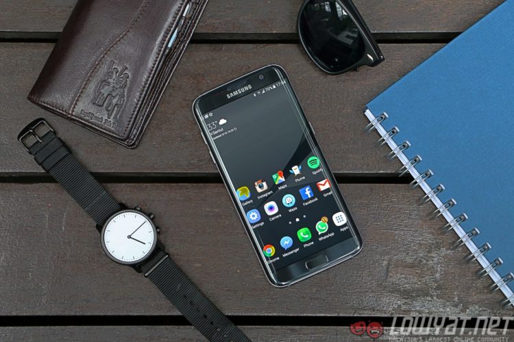
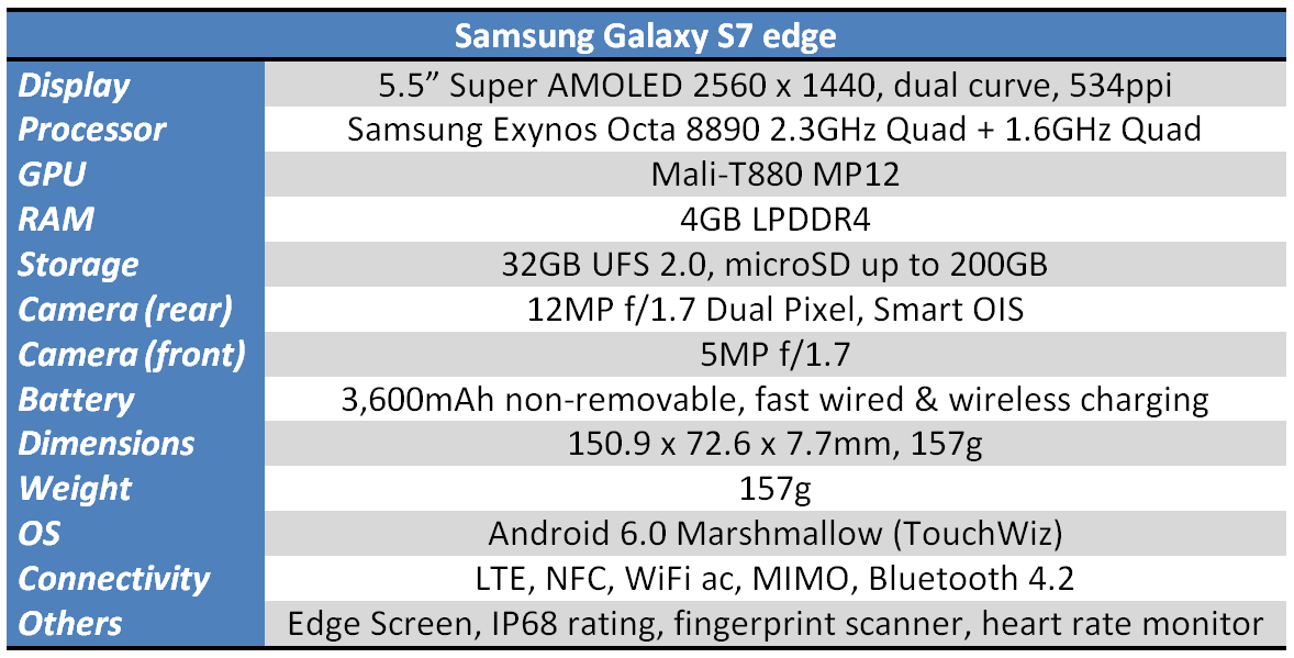 *For the Malaysian market, Samsung will be shipping the dual-SIM, Exynos 8890-powered Galaxy S7 edge.
Benchmarks
Software
The device I was using immediately before the S7 edge was the Galaxy Note 5. Both run on Samsung’s TouchWiz Android skin, one that carries a strong reputation of being heavy and unapologetically ugly.
Those who have used the S6 and Note 5 will know that both claims are simply no longer the case, and the S7 edge further weakens this reputation.
It’s time TouchWiz shed its poor software reputation
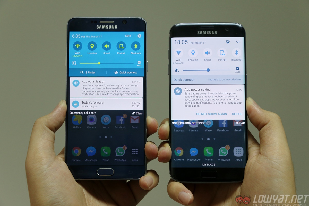
With Android 6.0 Marshmallow underneath, the TouchWiz skin is further enhanced in a few meaningful ways. First and clearly the most important is the removal of the turquoise-lime green colour combination on the shortcut panel on the notification shade (finally!). On the S7 edge they are now in a modern and pleasing white and blue combination, with an equally slick sliding animation that you can’t even find on stock Android.
When first setting up the device, another software addition appeared as a pleasant surprise. On the new TouchWiz, you can now easily move multiple app icons between home screens. It’s quite similar to the mechanics found on MIUI, and something sorely missing from mainstream Android ROMs.
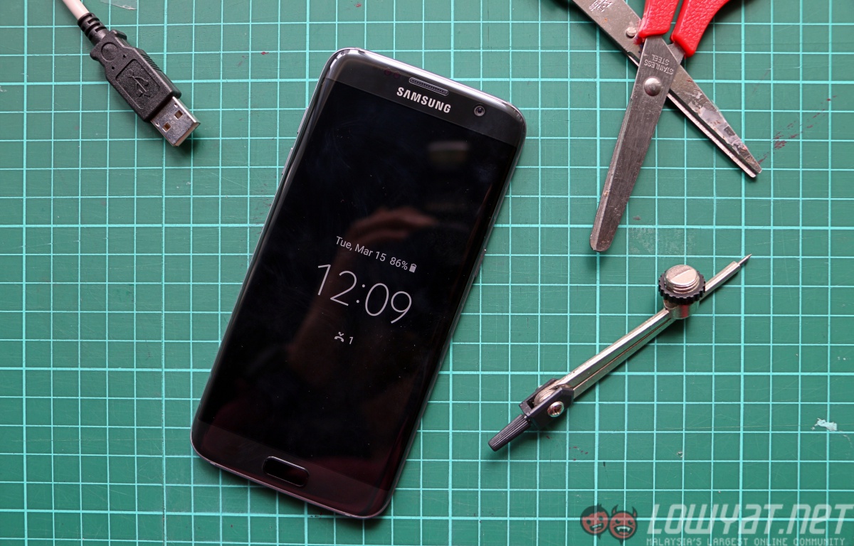
In addition, there’s also a new always-on display (AOD). In theory, this is a fantastic addition and honestly, something that should have been incorporated into Android smartphone for years. It’s even more criminal that Samsung did not incorporate this earlier, since this technology is perfectly suited for AMOLED screens (only individual pixels are lit, ensuring minimal impact on battery life). If Nokia could do this back in 2011 with the N9, how on earth did it take five years for Samsung?
If Nokia could do it in 2011, why could Samsung only do it in 2016?
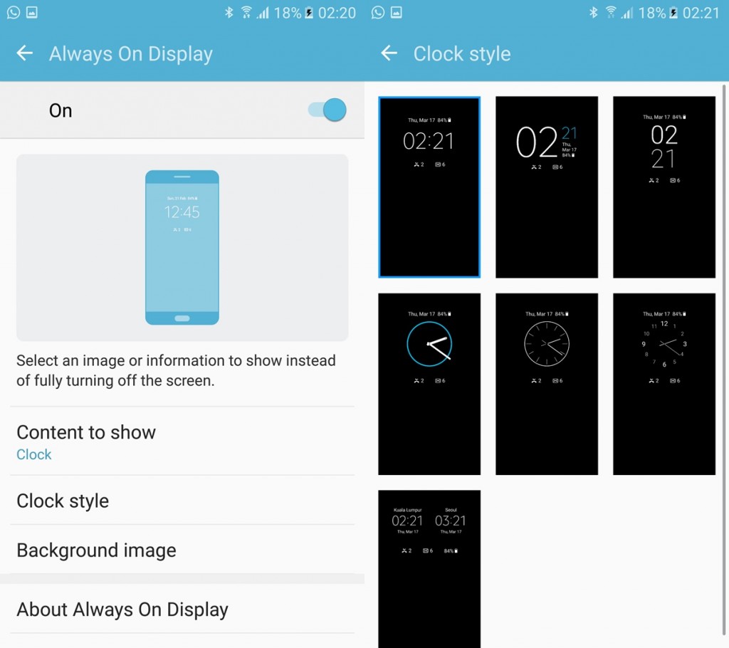
The always-on display can be customized to show a clock, a calendar, or a preloaded stock image. The battery percentage will appear on all versions. You can also choose between a selection of clocks and calendar designs.
However, this is one of the laziest implementations of a new feature I’ve ever seen.
Besides the options mentioned above, there are no actual customization options. It’s immediately apparent when the only notifications that will be displayed in the always-on display are missed calls and unread texts; you won’t find notifications for WhatsApp, Facebook or even Gmail. There is no way to add or customize which notifications to display, and that’s unbelievable on an Android device.
I can still do this easily on my Nokia N9, while on Android I previously used an app called Dynamic Notifications. This app is basically a reverse-engineered piece of software that first appeared on the first-generation Moto X, which wakes the display when you receive a notification. Dynamic Notifications lets you customize which app notification turns on the display, allowing you to see if it is worth unlocking the device for. You can do none of these things on the AOD of the Galaxy S7 edge.
Eventually, I turned off the software feature that I was initially most excited about.
I turned off the software feature I was initially most excited about
If you search deeper into the Settings menu, you’ll find more interesting things. For instance, there’s a submenu called “Advanced Features”. You can toggle options here such as the quick launch camera gesture, one-handed operation, and the most interesting part: Galaxy Labs.
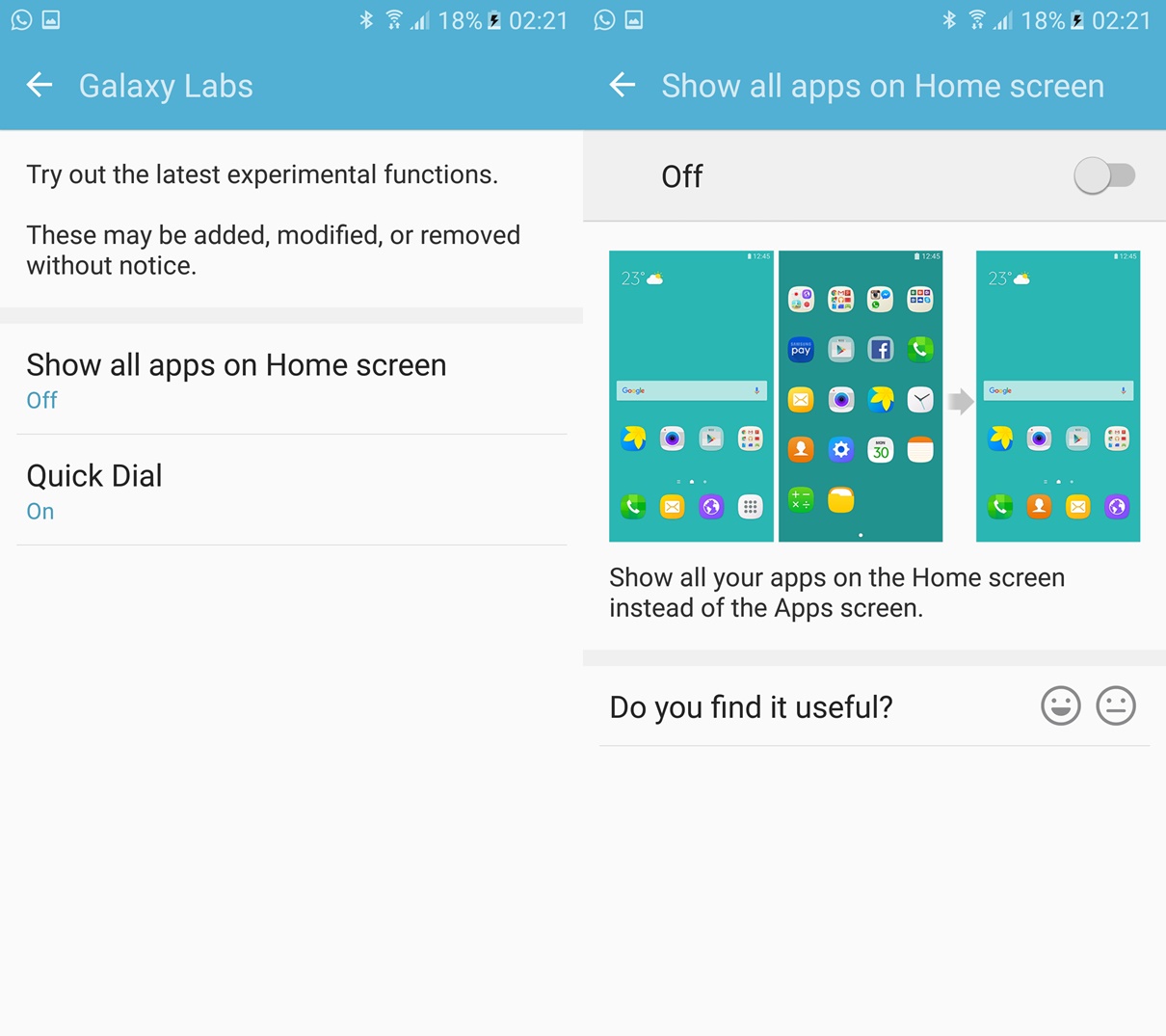
Here, you’ll find experimental software functions that you can try out on the phone. There are currently two such functions available for trying. The first, and perhaps most interesting, is the option to remove the app drawer from the UI. With iOS not having an app drawer (and the fact that most popular Chinese Android ROMs also do not have one), this function may be helpful for those who are not familiar with Android navigation.
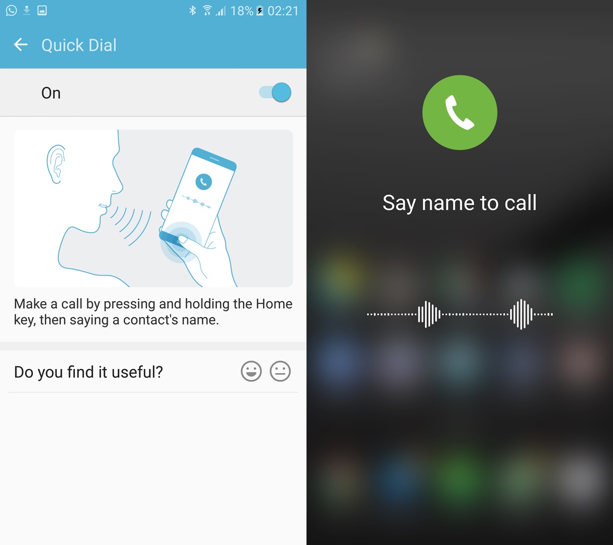
The other experimental function is called Quick Dial. This allows you to call a contact simply by pressing and holding the Home button and saying that contact’s name. Enabling Quick Dial disables Google Now since they share the same gesture. After trying it for a few minutes, I found that the voice recognition software improves in speed and recognition after saying the same contact name after a few tries.
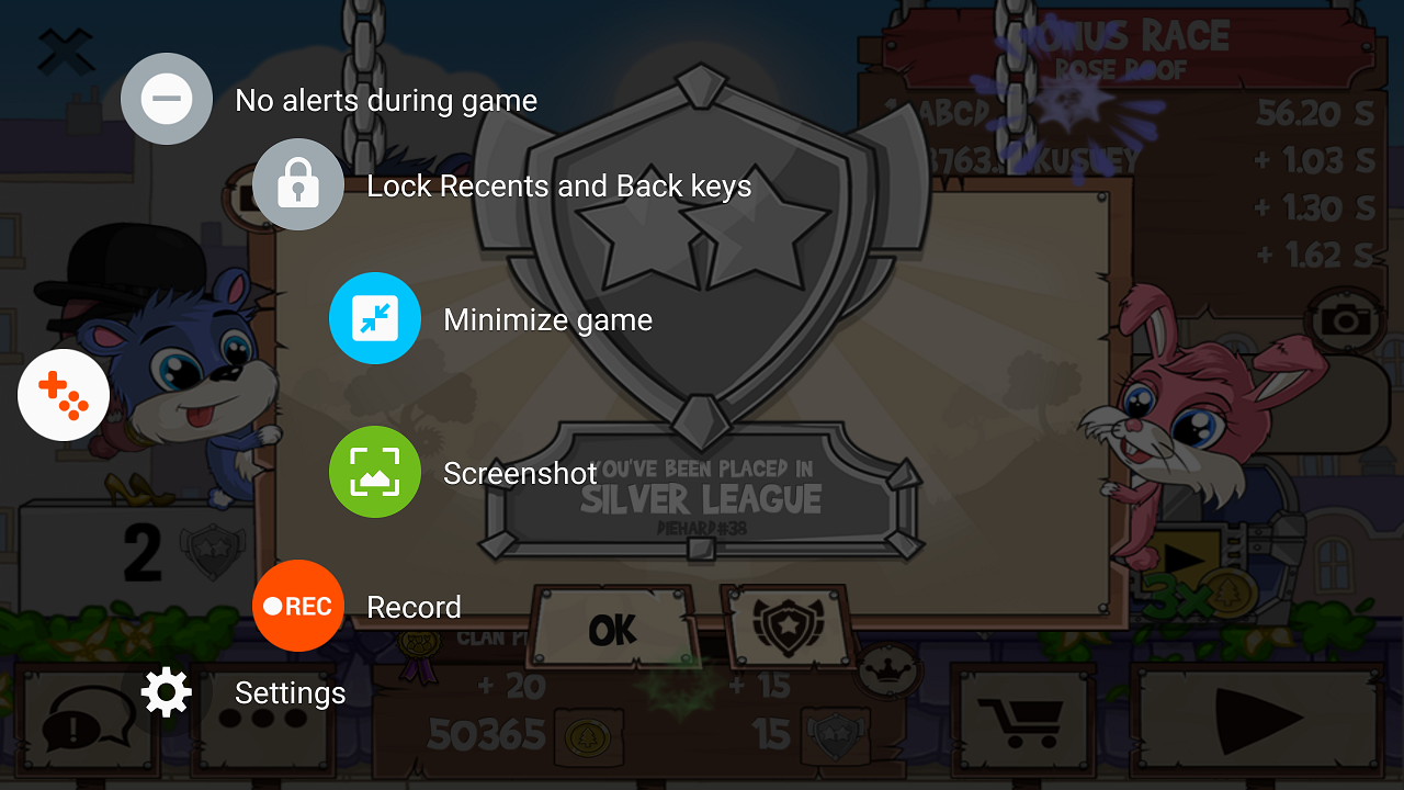
Another new addition is the Game Launcher. This is essentially Samsung’s take on creating an immersive mobile gaming experience, and it does so by offering a floating button that expands in a similar way to the Galaxy Note 5’s Air Command. You get a series of buttons that offers options such as locking the Back and Recent Apps buttons (which is very useful in some games), disable notifications, capture screenshots, or even record on-screen footage of your game with the option of turning on the mic.
I’m not a serious mobile gamer, but I can immediately see the appeal in the ability to turn of the Android navigation buttons. On the other hand, the ability to record up to Full HD on-screen footage and activate the front camera seems like a very powerful tool for gameplay and reaction videos for YouTubers.
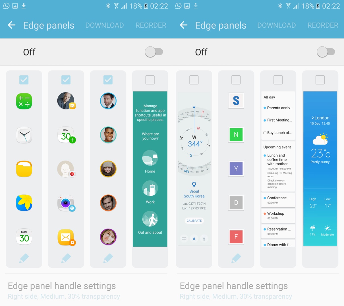
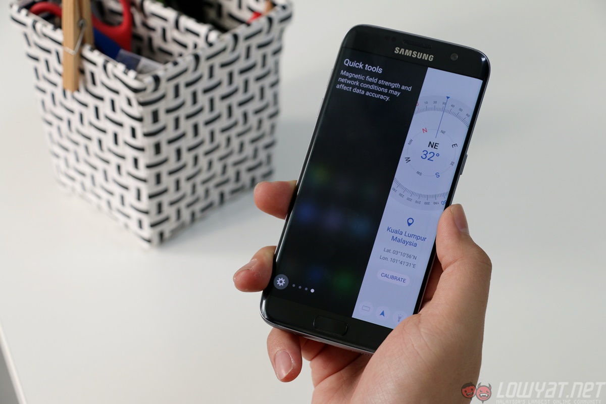
Of course, the final bit of software to talk about is the Edge Screen. Samsung’s actually doubled the width of the Edge Screen now, making it potentially a lot more useful. It can display a lot more information, allowing you to display things like a calendar widget, compass, or simply put two rows of your most used apps or favourite contacts.
You also have the option to download more Edge panels (which they are now called). There’s a data usage monitor, CNN news panel, and paid ones like a file manager (RM6.12, really?!).
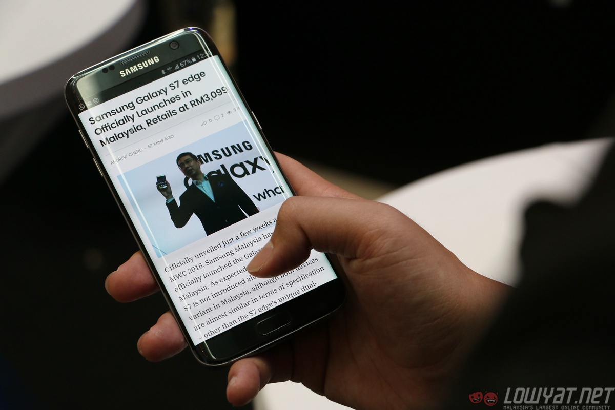
Once again, despite Samsung’s best efforts, the dual-curve display offers little to no additional value to the user experience (UX). If anything, the lack of side bezels and poor palm rejection software can be a frustrating combination that outweighs the stunning good looks and software features.
Despite Samsung’s best efforts, the dual-curve display offers little to no additional value
The only saving grace is perhaps the fact that because the screen wraps around the sides, the S7 edge has a markedly smaller footprint. It also means that it is remarkably comfortable to use with one hand, something not all 5.5-inch “phablets” can claim to be.
Overall, the software experience on the Galaxy S7 edge is a really positive one. I did not experience any software related hiccups, nor were there any lags in animation despite being what I consider a “heavy user” with four Google accounts and three cloud storage apps running and syncing in the background, and plenty of camera use throughout the day.
This is easily Samsung’s best TouchWiz to date, with modern colour combinations, sleek animations, even fewer bloatware, and pleasantly snappy performance. Coming from the Note 5, the changes aren’t immediately apparent, but I grew to appreciate the ones that I noticed.

