Instagram has finally released its latest update, which brings about a major overhaul in the app’s design. Do not worry because in terms of functionality, Instagram’s mechanism remains the same.
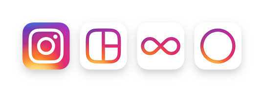
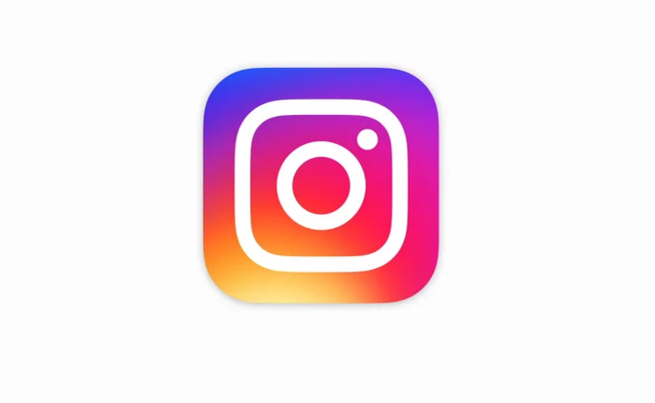
Sporting a new logo, the retro camera has now been transformed into a more minimalistic one, with the iconic small strip of gradient retained; it now wraps around the entire icon.
Instagram mentioned that the app has grown a lot and it’s all due to the contribution from the community. The app is inspired by the community, and its new design is a reflection of the diversity and vibrancy of its users’ stories.
Apart from Instagram, the company has also made the design changes to its other creative apps including Layout, Boomerang, and Hyperlapse.

The app’s major design overhaul has been receiving mixed feedback, but we have to say we like it. It seems that Instagram is going for “contrast”, where everything is dialed down to make your photos pop. For example, the app’s new colourful icon might just be the most outstanding one in your app drawer now. Once you fire up the app, the UI is reduced to black and white, so the emphasis will now be on the photos instead.
The Instagram update has been rolled out to both iOS and Android, so do check the Apple App Store and Play Store for the update. What do you think of the app’s new look?
(Source: Instagram Blog)
Follow us on Instagram, Facebook, Twitter or Telegram for more updates and breaking news.


